Garmin Cyberpunk Watch Face
Preem Cyberware
November 2025
This year I bought a Garmin to help me train for a half marathon (and hopefully a full marathon in the future). I have a love/hate relationship with smart watches. I think that having notifications on my wrist is pretty annoying. I wouldn’t want the watch to be more powerful than this (like an Apple Watch). I typically use a very minimal watch face.
At the same time, I think data can be pretty. Most watch faces that show a lot of data are overloaded with labels and icons. The Cyberpunk aesthetic makes data overload fun. So that’s what I made.
Garmin ConnectIQ Store Description
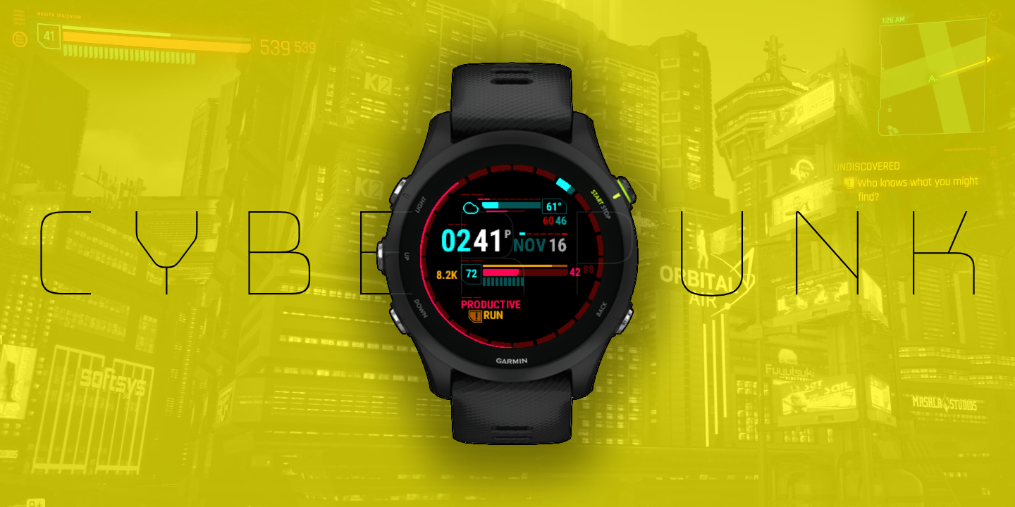
Hey choom, get a load of this preem watch face. Your cyberware’ll be lookin’ nova with this HUD straight from the streets of Night City.
Detes:
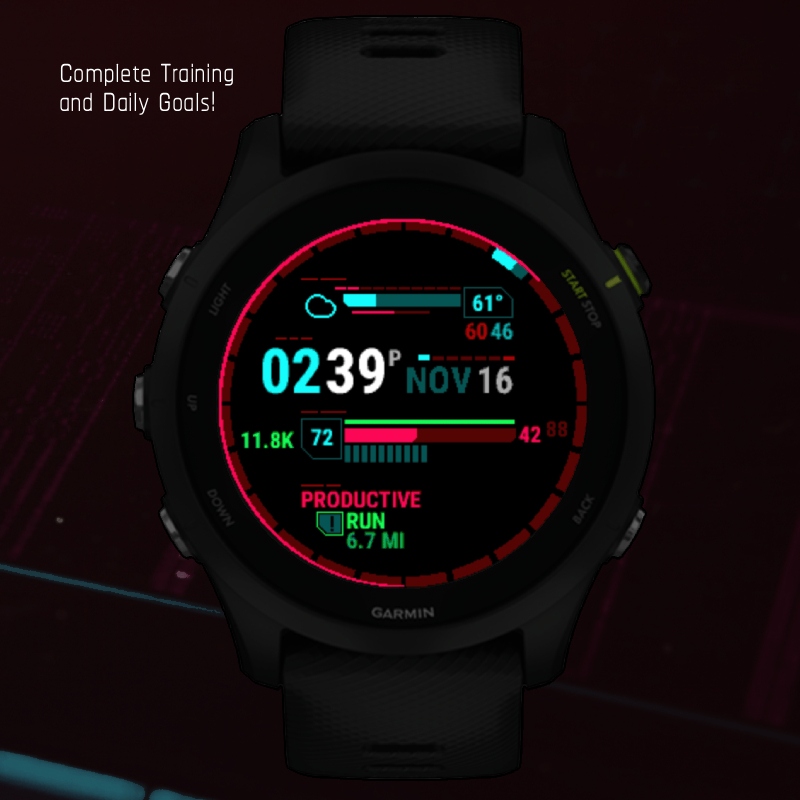
Flatline- check your health bar and don’t get zeroed, featuring daily goal tracking, body battery, and heart rate with hr zone.Chippin' in- keep your fixer happy and see your latest activity and training status in the mission section.Riders on the Storm- see the weather for the day with this custom HUD, featuring UV index, precip chance, humidity, and the high/low.Who's Ready for Tomorrow- a 24 hour bezel shows the time of day and a second hand. Also shown are the time, date, and day of week.
Enjoy the new chrome Rockerboy, this netrunner’s gotta delta.
Inspiration and Mockup
Cyberpunk has a pretty informative HUD (which fits the vibe of the game). The most obvious thing to replicate from the HUD is the health bar, as you’re also tracking health with a Garmin. I also wanted to replicate the mission progress / current task UI.
For the health bar, I felt body battery was a good match, the yellow stamina bar would track your daily goal, and the slots that usually represent your CPU usage would be used for heart rate. The active mission would be your training status, and the current task would be whatever activity you did last.
The rest of the screen I would have to come up with components of my own. But I kept with the color format, that yellow was actionable and green was complete. Red and blue kind of get used interchangeably.
Features
I ended up managing to fit a lot of information into this watch face.
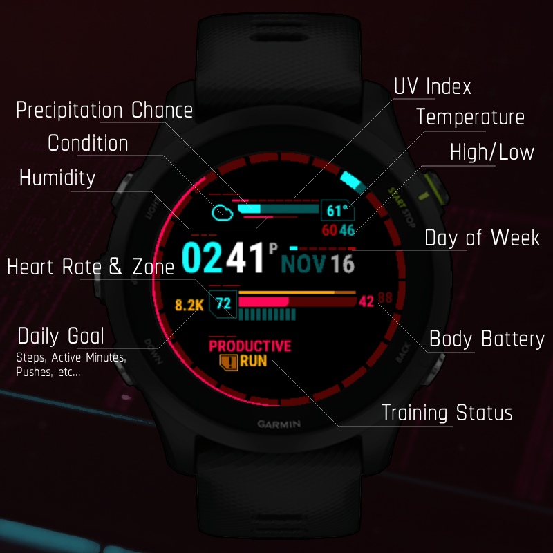
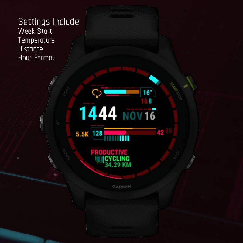
Weather
- weather condition (blue or yellow)
- uv index (blue or yellow)
- precipitation chance (blue or yellow)
- humidity %
- current temp
- high / low temp
- wind speed and direction
Time
- time of day (am/pm or 24 hours)
- day of week (starting Sunday or Monday)
- date
Health bar
- daily goal number (number, green or yellow)
- heart rate
- daily goal percent (bar, green or yellow)
- body battery, with current and max
- current heart rate zone
Activity
- Training status
- Last activity (green or yellow)
I also made the choice to start the second hand, and hour indicators from the bottom center. This better reflects the sun’s position (although the watch does maintain clockwise movement rather than east-west movement).
I think the watch is very rewarding when you complete your daily goals and exercise.
It was also important for this watch to be available for Europeans.
Plans
This watch has had plenty of feedback online, so I want to keep working on it. But a lot of the work can be tedious. Looking forward, I will keep the current version online as a free tier. When I get around to making changes, like:
- support for more watches
- moon phase
- more settings
- battery and bluetooth indicator (which I personally dislike)
- more weather icons
- use the actual Cyberpunk font
When I get around to making these changes, I’ll make that new version a paid version.